Music Video
The typical conventions and form of hip-hop videos are
sub-performance and sub-narrative type of music videos. An example of a typical hip-hop video which
follows these conventions would be ‘Runaway Love ft Mary J Bilge – Ludacris ’
the video is full of cuts between shots of actresses playing the roles of the
personas of the characters described in Ludacris’ lyrics and shots of the two
artists performing their parts in the song. This convention is also necessary
for this type of hip-hop song because there is a story clearly being set by
Ludacris’ lyrics and the chorus is directly talking to people who are like the
girls who are the subject of the song. In fact I think it was essential to have
actresses as physical representations of the personas, then to put them in cuts
with the rapper in the background so a connection is instantly made with the
narrative lyrics and the story they’re acting out. To have Ludacris, as this omniscient
and unseen narrator is so powerful as it signifies how he can only watch as he
sees his personas struggling but he also represents the hope of someone who is
caring towards the victim.
We definitely tried
to incorporate this sub performance and sub narrative type of convention in our
video we knew that we couldn’t directly emulate the omniscient narrator style
in the video of ‘Runaway Love as it would be a misusing the significance behind
an epic technique for a softer product. For example our first draft of the
video had the artists in similar scenes as the couple of the video even though
we thought this would be a creative aspect to have in the video. Unfortunately
it made the artists look like they were stalking the couple and looked weird
instead of looking mysterious and romantic as it was aimed to be. So we decided
to film the artists performing their parts in the daytime in the exact same
area so they was a clear relation with the artists and the couple of the video,
without the artists looking like they were too close but still having relevance
to the couple. (Show example of this in the video) We also decided to emulate
the style of showing the artist performing the verses while the narrative of
the video ran throughout the video this was done by cross cutting two layers of
video, one of the main artist (rapper) performing the verse in the dark studio
and another of the acting out of the story of the verses. This way the audience
could connect with artist and see their passion in their performance but well
represented so the audience can enjoy watching them without losing out on
footage of parts of the acting of the story in the video.
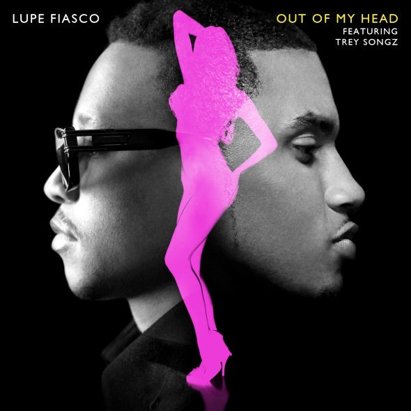
Our second edit of
the music video became very similar to another video we researched in the
concept creating part of the music video process, this was the video of Lupe
Fiasco’s single ‘Out of My Head’ this featured vocalist Trey Songz. As Lupe’s
video took the audience through shots of the artists performing, then of the
artist with the video girl who was playing the role of the woman in the song?
We purposely emulated features of the video such as having the main girl
dressed with red garments, as Fiasco had her wearing red in the lift scene of
the video just as we had our actress wearing red in the shop scene. Then also
we had shots of the artists performing with a landscape behind them during the
break in the later part of the song just the same way that Fiasco and Songz are
shot performing on top of a large building with the landscape behind them (Show
video of both music videos, clearly point out how we used the highest point
that was available to us and tried to use it just the same way Lupe’s video
tried to use it). Fiasco’s video there was parts of the video where the main
guy was shown among his friends and not only with his partner. I feel this
showed the audience that he was like most people who have lives outside of
their work/study/profession so we liked the realistic element of this, we
decided to emulate this by allowing Kashif’s friends to be with him in the
beginning that were just keeping him company. Also to authenticate the scenario
presented in the video.
We developed our music video, more than we originally
planned as we made a second improved edit of the video; this was mainly due to
the very detailed feedback we got from our audience that helped point out the
good things and enhance the bad parts to make the video an overall good music
video. There were additional shots of the artists, more symbolic editing,
shorter intervals of shots of the area and much better lip-syncing from the
artist.
Even though Lupe
Fiasco only used a few moments in the video of his lady dressed in red he still
followed the convention of representing a sexually attractive woman wearing a
red dress, we wanted to challenge this trend and decided to make October wear
red less blatantly than the woman did in Fiasco’s video. First reason was because we believed it would
have been too mature for the age of our target audience meaning that the artist
and cast would have looked quite mainstream playing roles that were very
different from their true features. Second reason is that we thought it would
be a creative challenge to represent this romantic costume colour with a
combination of different items from the norm.
Also Fiasco’s
costumes didn’t change for any symbolic reasons although the main actresses’
costumes changed for a symbolic reason we decided to challenge roles and make
Kashif’s costume change through the video. By making his tie change colour from
black to red to sure how he had got himself indulged in October the same way
she got indulged in him and involving Kashif in her personal life by letting
one of her friends meet him during their romantic walk down their path at the
end of their video.
Song
There were three
songs that I used as references of how our song should sound. Helping me decide
what genre it will be, the contents of the lyrics, my delivery of the lyrics
and the amount of artists featuring. The three songs were Lil Wayne – So
Special ft John Legend, Nujabes - Lady Brown ft Cise Star and Lupe
Fiasco’s-Kick Push.
I really liked the
way the rapper Cise Star described his lady in Lady Brown he found ways to
compliment her appearance and personality without demeaning her. I also liked
his poetic vocabulary and verbal artistic skills portrayed in the song, as he
didn’t follow the fundamentals of mainstream rap but the language use of
underground hip hop. So I tried to use every good part of the song I could for
guidance when I was describing how I felt about the lady in my lyrics, for
example Star says ‘You are the personification of all God's blessings’ this
shows that he was really thinking of the best features of a woman, his word
choice really lets us believe these lyrics are from his heart especially as
this is such a strong religious line for a hip-hop song that isn’t gospel. So
keeping this in mind, I wrote these lyrics: ‘Ruth like creature, like ancient
scripture… a blessing to hear…’ directly emulating this concept of using
religious imagery to describe the female to give this true and divine vibe to
the song.
I liked Lil-Wayne’s
song So Special’s arrangement as he had R&B vocalist John Legend featuring
on the song with him, I liked the parts when you could just hear John Legend
just singing runs and bridges as Lil Wayne voice is still heard in the chorus.
As John legend was doing exactly what he was supposed to do which was just to
compliment Lil Wayne in song and doing an incredible job of it while Wayne’s
presence on the song is still superior. So when SVF and I were discussing how
we were going to arrange the song and what his role was going to be in song I
really let the arrangement of that song lead me. For example the fact that you
hear SVF sing a run before I start rapping just like we hear Legend sing a run
as the beat of the song starts. Then SVF and I decided to improve on this song
arrangement by adding a break to the song, as there was an unused space left on
the beat we thought that we could change the style of the flow and the vocals
in this part of the song and could creatively express the last part of the
story in the song.
Lupe Fiasco’s song
Kick Push is a rap song that has what is called a recurring bridge, which is a
chorus that changes throughout the song. Most recurring bridges are used to
show a progression in the story of the song. As romantic hip-hop songs are
supposed to be anthems for their target audience the choruses of the song are
supposed to be same throughout the song and repetitive so that they’re easy to
remember and raise the likelihood of sticking in the audience’s head. However
since we decided to use a recurring bridge in our song we rebelled against the
stereotype here but we also challenged the chorus types more as the actual
lyric ‘looking at you’ that is sung by SVF is the same and repetitive. This
means that we challenged the typical R&B/Rap song type as we challenged the
features of the chorus.
How effective is the combination of your media product and
your ancillary texts?
My album cover at
first was a quick production and looked very amateur consequently it received a
lot of negative feedback from a critical audience that expected better and
stronger evidence of creativity. I referred to the single artwork of ‘Out Of My
Head ’that had a photograph of both artists with their photos back to back with
a silhouette of a hot girl in the middle of them this worked for the simple and
neat arrangement that the designer had given the cover. However I tried to
experiment with colour filters and really used the colour red too intensively
so it didn’t look very professional in fact it looked the opposite so I learnt
from this and tried a completely different route with the album cover. As ‘Lady
Brown’ lyrically influenced me I remember looking at the album cover and being
impressed by it, as it was abstract but still well drawn there is good blending
within the moving organisms on the album cover, in fact they almost seemed like
they were growing within the drawing. So this reminded me of some new art
concept I was experimenting with art, so with these two influences I drew an
artwork draft to draw out the shapes I would follow on the computer. The final design took me a total of just over
7 hours then the magazine advert just followed the growth/nature idea from the
album cover without outshine the album artwork. Now just like the second music
video the second album cover received a better feedback than the past one, one
of the audiences said they could imagine an established artist with that type
of album artwork and a few musicians asked for me to do some for them. This
inspired me to experiment more to develop this style of art. The views of our
music video are still growing probably partly due to the quality of the album
artwork that is recognised by an audience from Facebook/Twitter.
What have you learned from your audience’s feedback?
Firstly to touch on the negative side of the constructive
feedback regarding to the music video, half an amount of our audience felt that
they didn’t get a chance to gain a proper connection with the artists in the
video. So we learnt that if you are going to shoot a video that’s a cross
between a performance and non-narrative music video needs to establish to the
audience who the artists are if the director wants them in the video regardless
of how humble the artist’s are trying to be. The audience also didn’t
understand the role of the couple; we later understood the reason why they
couldn’t see their role was because we didn’t make it clear enough that they
were a couple, we could of made it clearer by having facial close up shots of
each individual and close ups of them as a couple which would of signified
intimacy in their demeanour.
Although we felt
that the negative feedback impacted us the hardest because the audience had
criticised the most significant features of the music video, their positive
feedback also persuaded us there are many good features of the video. For
example they said that our music video had a beautiful location and our shots
of our locations looked great especially the establishing shots of the
location. A lot of the audience liked the improved song also, much more than
the first draft, this was good, and as we knew that we had succeeded in
pleasing our audience.
We had a few people that had problems with the song; some of
the audience felt that the song was cheesy as they said that Volas (me) was too
soft in the description of the lady of the song. The group and I disagreed with
this statement, as most of our audience were males we concluded that the reason
why they decided my lyrics were too cheesy was because I didn’t mention
anything sexual, however we even questioned the comment in the first place as
Volas’ lyrics challenged the norms of lyrics in typical UK Rap music
Our audience are
the most important attribute of this project whether we like it or not. This
point is most proven in our project by the fact we made a second version of the
video due to the detailed critique we received of the first release. The
audience’s feedback is vital regardless of how much work you put towards the
media product because it is impossible not to see your work in a certain way
that will limit your ability to receive the product as it truly is. Whereas an
audience always have a second person’s perspective, which is effective because
regardless of what you are doing, two heads are always better than one regardless
of knowledge of the second head.
How did you use new media technologies in the construction
and research, planning and evaluation stages?
To actually create
the song we used a range of equipment and software. Martin used FL Studio which
a music making software to create the beat of the song. We used the Blue Yeti
microphone that allowed SVF and I to record our vocals through Adobe Audition
that was also used to arrange and from the complete song.
In the researching stages we watched many music videos for
example Bobby Valentino’s Anonymous video and other R&B music videos using
the website Youtube. Youtube is a video sharing website that allows users to
upload, view and share videos. It allows users to upload high definition videos
too, which was great for us when we were studying professional music videos in
the original quality the director wanted them to be watched in.
We accessed Youtube
and other websites for research using Safari, which is an apple, created web
browser that is the default web browser for apple products and an alternative
browser for window operated computers too. Most of the research we investigated
together was in our college studio, the computers in the studio are Apple iMac
Cores, these are not the latest iMacs available but they are more than enough
of a computer for a creative person. I was experienced with the Macintosh user
interface so it wasn’t difficult to operate in some ways I prefer the Macintosh
user to the Microsoft user interface.
We also used social
networking sites such as Facebook, Twitter etc. We used Facebook to broadcast
our surveys to all of our friends that had an estimated reach of approximately
2300 people between us. We also used Facebook to share both of our music videos
and we used them a medium for our audience to give us feedback on them. We used
twitter to also spread our music video and also to observe the artist’s fan
base to see if the release of our media product had any effect on both of their
individual fan bases.
During the planning
part of the project, we gathered filming equipment; we gathered two cameras and
one tripod. Personally I was responsible for getting hold of the SLR camera
Canon 550D, Martin the co-director hired the camcorder Canon Legria HF 20 which
can film videos in full HD 1980x1080. We used the Canon Legria to practice
taking shots of the location we were going to use for the video such as the red
filter test, the fast motion tests; my personal favourite was the footage of me
walking in the middle of the road which was called Fast Motion 3. I used the
canon 550D to record the things that happened behind the scenes, when we were
on the set of the music video. The canon 550D films in full HD also this was
very useful as most of the shooting was done outside and this meant that the
camera could pick up things they may have been missed of we were using a lower
video quality. The behind the scene video was great for showing each member of
the team playing their individual role in the project and how much work was put
during the actual shooting process regardless of the fact we shooting in
freezing conditions of the Christmas holidays. This videoing quality was also
useful as the Canon Legria ran out of battery life when we were filming the
last scene on our last day of filming so the 550D was a great substitute
camera. The fact that our video was shot in full HD, probably contributed to
the reasons why we received positive audience feedback regarding our
establishing shots them saying that some of our shots were beautiful. The only
problem two problems I had with the Canon 550D camera were a memory card error
and the camera fogging up. When I was using the camera a message would come up
that read ‘the camera has automatically stopped filming’ so I researched about
the problem and I found out that the memory card we were using was under two
classes than it was recommended to be. We didn’t have enough money to buy the
card in the right class so we just endured and did our best to avoid the
problem as much as we could by filming footage as quickly as we possibly could.
Martin was the main
editor behind the video; he used a Microsoft Windows 7 operated laptop to edit
the practice videos and the music videos, as it wasn’t a Macintosh operated
system he couldn’t use Final Cut Pro so he used Sony Vegas instead which was
just as good of video-editing software. As I wasn’t the main editor I didn’t
get to actually use Sony Vegas independently however I assisted Martin in the
second edit of the music video so I was able to understand how the Sony Vegas
interface worked. I felt that it was very user-friendly and had exhilarating
video editing features that a skilled editor could create videos that are
breathtaking experiences for an audience. However I preferred the user
interface of apple’s Final Cut series because Final Cut had a range of features
with almost unlimited adjustments an editor could use to their own preference
to craft every video that is edited into film. Plus final cut developers and
users offer a range of plug-ins for additional editing features if an editor is
unsatisfied. However I admit my reference is maybe biased as I have had access
to a MacBook with final cut express during this project although the express
version is not like the pro version that I used last year in college, but I
still have really got used to using the Final Cut Series.
We used Youtube to
broadcast our music video to a worldwide audience. Youtube is great because it
is free; it has over 628 million visitors monthly, it is part of the Google
Company, which meant that if people searched the artist’s names in Google our
music video uploaded on Youtube would appear on the first page of results.
Youtube has got a great method of keeping their users informed with the
statistics of every single video a user uploads on their account. It also
allows viewers of the video to see the statistics of the views; how many views
how video has, the timeline of the views that the video, the genders of the
viewers and the continents of all of the viewers of the video. This feature has
been very useful to us when we were analysing the statistics of our video, as
it was the prime source of information for the evaluating process.
I used Adobe
Photoshop cs4 and cs5 to design my digipak; Photoshop is my favourite image editing
software. It has a range of canvas sizes, brush tools, vectors, fonts,
gradients, image filters, colours, other photo editing tools to offer to users
and just like final cut these features have a range of adjustments that the
user can play around with. Another benefit of using Photoshop is that it has a
large user-made brushes/shapes/gradients community, for example I used tree
brushes created by another Photoshop user for my magazine advert. I had created
many vectors over my few years of experience with this software, I see myself
using this software for a long time unless graphic designing software tops
adobe’s products.
I used a Hitachi DVHv595E camcorder to record me talking for
this video and Final Cut Express 4.01 to edit this video on my hired MacBook. I
used KeepVid to download Youtube videos of the music videos I included in this
evaluation. I used Xtranormal storytelling to present this last question of my
evaluation.
by: Ayo.Volas


 Martin: Kashif's Friend No1
 Daniel: Kashif's Friend No2
  October: Main Girl
 Stanley: Kashif's friend No3
 Ayomide: KdotC (himself)
 Elsie: October's friend
 Kashif: Main Guy