 |
| 1st Draft |


 |
| Nujabes- Lady Brown Cover |


I wanted to go for a simplistic yet effective design for the digipak so it wouldn't be too expensive to re produce and sell as a product along with the actual tracks on the single. Also keeping it simple makes it more direct to the audience and the more direct the advertising is the more effective it is.
I also wanted to keep this colour choice of red throughout the products of the single to fit the typical tehmre of romance and passion, plus keeping then all similar makes them easier to connect by the audience. Also as i didn't want to really show the artists face more than it was necessary to because i wanted to show the couple from the video too to use them to illustrate the title of the song, so the audience get another direct reference to what the song is about.
So first i had to get a photo of the artist to be taken how i wanted to show their face and it had to be taken with a good quality SLR camera so there would be no limits on the editing process of the image. So
I got six different photos to be taken of him then I choose three i was happy with and that i would use the one out of them that his face looked best in. Then when i made the choice, i started thinking of how i can make his face look smoother as the artist had a spot on his face in the photographs and i didn't want to show this, plus his face looked abit rougher than I wanted to be so i had to make his face smoother using Adobe Photoshop. I knew my laptop had this software and it would perfect to deisgn it as it would also mean i can carry my work around and work on it anywhere i had a place to sit down in my free time.
SO THE DESIGNING BEGAN!
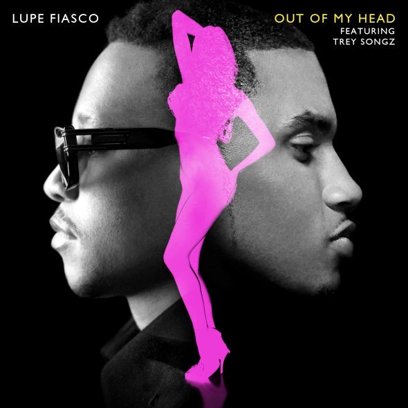
As i was basing the design of the CD on the design of the CD for Lupe Fiasco's single 'Out Of My Head' i just checked it again to note down the things i wanted emulate to my own design.
1. A clear shot of both artists faces, with an equal amount of space used, this symbolises a mutual focus on both artists not just the initial artist (Lupe Fiasco) .
2. Black background keeps both looking mysterious.
3. Black and white filter on the faces, as a symbol of honesty? "Lets see this in black and white"
4. The main colour themes are pink and black, keeping it plain and simple.
So with these things in mind, i started designing, i wanted to go for a red and black theme, so first i had to get a black ground, so i simply just open up photoshop and used the paint bucket tool to make fill the blank canvas with a flat balckground. Next i choose the first photograph of me (IMG_0273.JPG) and cropped my face and my collar out so i could copy and paste it on my black canvas. I also precisely cut the face in half and choose the side with the least amount os spots. Now when I copied and pasted it i didn't like the texture of the artist's face as it looked too rough so i had to find a way to smoothen his face, i knew the procedure was normally called airbrushing so i searched on the net how to do it, as i knew a way to do it with the blur tool and the spot healing tool, but i wanted to learn if there was other methods. I checked and io only found ways to smoothen the face and artifically make the face look more realistic so i just choose to use my own methods. After the long process of airbrushing, i got a face i was happy with then i just copied and pasted it onto my black blank canvas and started to think of ways I could put the song title and the artist names. I just played around with text and behind the scenes photographs, as my face was the main feature of the album cover.
However when i released the design i received heavy criticism
the audience were not satisfied with the design, in fact for some they were disgusted with the design and claimed it looked more scary than romantic.
So i thought of a new design I could do as soon as possible, i then referred to the Nujabes-Lady Brown single cover, that had really impressed me before, as it was art for an album cover.
Under this new 'artwork' notion i started working on a new design, first i drew the skeleton form on paper then i took a photograph of it and uploaded it on photoshop so i could work from it.
Then using the mouse i started to draw it out on photoshop, constantly changing between colours and shades to ensure that it wasn't just colours thrown around but lighting/shade was involved in the artwork too.
This design took me hours to finish, as it was my first time drawing with a mouse on the computer, once i finished the artwork i had to choose a natural font and a background that followed the natural theme without overdoing it.
Once i did all of these things, the album cover was finished and as i felt the design had enough going on i decided that the rest of CD album would compliment the front and not outshine it. So i followed the same colour schemes.

 |
| Lookin' At You Inside L |
 |
| Lookin' At You Inside R |
 |
| Lookin' At You Back Cover |
 |
| Screenshot Of Feedback On Album Cover |
 |
| Feedback On Magazine Advert |