Thursday, 15 March 2012

Ancillary Text Process

 So I had to make a Digipak for the track which involved me designing the CD cover for the CD single and the billboard advert.

1st Draft

Nujabes- Lady Brown
Cover

I wanted to go for a simplistic yet effective design for the digipak so it wouldn't be too expensive to re produce and sell as a product along with the actual tracks on the single. Also keeping it simple makes it more direct to the audience and the more direct the advertising is the more effective it is.

I also wanted to keep this colour choice of red throughout the products of the single to fit the typical tehmre of romance and passion, plus keeping then all similar makes them easier to connect by the audience. Also as i didn't want to really show the artists face more than it was necessary to because i wanted to show the couple from the video too to use them to illustrate the title of the song, so the audience get another direct   reference to what the song is about.


So first i had to get a photo of the artist to be taken how i wanted to show their face and it had to be taken with a good quality SLR camera so there would be no limits on the editing process of the image. So
I got six different photos to be taken of him then I choose three i was happy with and that i would use the one out of them that his face looked best in.  Then when i made the choice, i started thinking of how i can make his face look smoother as the artist had a spot on his face in the photographs and i didn't want to show this, plus his face looked abit rougher than I wanted to be so i had to make his face smoother using Adobe Photoshop. I knew my laptop had this software and it would perfect to deisgn it as it would also mean i can carry my work around and work on it anywhere i had a place to sit down in my free time.
SO THE DESIGNING BEGAN!
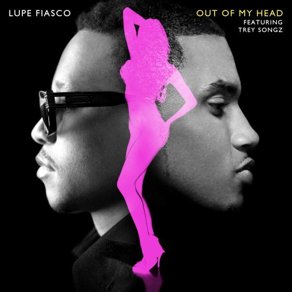
As i was basing the design of the CD on the design of the CD for Lupe Fiasco's single 'Out Of My Head' i just checked it again to note down the things i wanted emulate to my own design.
1. A clear shot of both artists faces, with an equal amount of space used, this symbolises a mutual focus on both artists not just the initial artist (Lupe Fiasco) .
2. Black background keeps both looking mysterious.

3. Black and white filter on the faces, as a symbol of honesty? "Lets see this in black and white"

4. The main colour themes are pink and black, keeping it plain and simple.

So with these things in mind, i started designing, i wanted to go for a red and black theme, so first i had to get a black ground, so i simply just open up photoshop and used the paint bucket tool to make fill the blank canvas with a flat balckground. Next i choose the first photograph of me (IMG_0273.JPG) and cropped my face and my collar out so i could copy and paste it on my black canvas. I also precisely cut the face in half and choose the side with the least amount os spots. Now when I copied and pasted it i didn't like the texture of the artist's face as it looked too rough so i had to find a way to smoothen his face, i knew the procedure was normally called airbrushing so i searched on the net how to do it, as i knew a way to do it with the blur tool and the spot healing tool, but i wanted to learn if there was other methods. I checked and io only found ways to smoothen the face and artifically make the face look more realistic so i just choose to use my own methods.  After the long process of airbrushing, i got a face i was happy with then i just copied and pasted it onto my black blank canvas and  started to think of ways I could put the song title and the artist names. I just played around with text and behind the scenes photographs, as my face was the main feature of the album cover.

However when i released the design i received heavy criticism
the audience were not satisfied with the design, in fact for some they were disgusted with the design and claimed it looked more scary than romantic.

So i thought of a new design I could do as soon as possible, i then referred to the Nujabes-Lady Brown single cover, that had really impressed me before, as it was art for an album cover.

Under this new 'artwork' notion i started working on a new design, first i drew the skeleton form on paper then i took a photograph of it and uploaded it on photoshop so i could work from it.

Then using the mouse i started to draw it out on photoshop, constantly changing between colours and shades to ensure that it wasn't just colours thrown around but lighting/shade was involved in the artwork too.

This design took me hours to finish, as it was my first time drawing with a mouse on the computer, once i finished the artwork i had to choose a natural font and a background that followed the natural theme without overdoing it.

Once i did all of these things, the album cover was finished and as i felt the design had enough going on i decided that the rest of CD album would compliment the front and not outshine it. So i followed the same colour schemes.


Lookin' At You Inside L
I didn't want the magazine advert to take the attention from the album cover but it still needed to be eye-catching and persuade the audience to buy the single, so I followed the 'nature' theme by creating a landscape scenery on photoshop and cropping it in the dimensions of A3 then choosing a font that fit well with everything and I was finished. So my final CD cover was finished (pictured above) and my magazine advert (pictured left) was finished also and both received good feedback with the audience and encouraged other musical artists to ask me to design their next album covers.
Lookin' At You Inside R


Lookin' At You Back Cover
Screenshot Of Feedback On Album Cover
Loo
Feedback On Magazine Advert


Monday, 6 February 2012

My visit to JumpOffTV

While i was researching on UK hip hop, i decided to attend Jump Off which is a well known rap battling venue, it is also where Professor ! Green became famous. When i went there, first things first its so small! As in the venues is smaller than i thought it would be whenever i watched the videos of the past battles. The size of the venue reflects how big underground rap is in England where as a battle that is this well known in the US would have bigger crowds bigger spaces and probably more promotion. An example of this is is 'Em See' which is sponsored by Red Bull and is based on the storyline of Eminem's film '8mile' and involves rounding up rappers from different states and making them compete in a championship. It was good to see what community our music project would be contributing to.

Friday, 3 February 2012

2 Music Videos aren't we lucky?

Here is our first draft


Here is our final video


Finally the video has been improved and finished.

Cast and Crew

 So finally filming is on its way, we finally have a cast!!!! Getting a crew was easy, we just had to share the roles among each other (Daniel, Martin, Stanley and I), the toughest thing was finding a girl to be the leading actress, as the member of the group who was suppose to be responsible for recruiting the cast got an actress who unfortunately backed out in the last days towards the video shoot. SO WE WERE PULLING OUR HAIRS OUT ON THE LAST FEWS HOURS BEFORE THE FILMING DAY!!!!!!!
From 9pm to 2am in the  morning!!!!!! It was 5 hours of searching through all our of Facebook friends for a girl who preferably had blonde hair and would be free for a week after school who was pretty enough to make the idea realistic enough. After all the time searching for a girl on Facebook we concluded that a girl who had blonde hair would be a luxury more than a necessity all we needed was a girl who wasn't black as diversity in the music video was very important to me. So Stanley saw a friend of a friend on Facebook (who was October) that he thought would be the perfect girl for the video and when we saw her we felt the same, luckily i actually met her and could contact her on Facebook. I did and she was so comfortable and happy to do the video plus she was available for the week we planned to start filming so everything was perfect!


Final Cast 
Martin: Kashif's Friend No1
 October: Main Girl
  Stanley: Kashif's friend No3
 Elsie: October's friend

Kashif: Main Guy

Saturday, 31 December 2011

The Song is ready and so is the Video

So finally after 1-2 weeks of filming we finally had all the footage we needed to make the video! As i agreed i would edit the behind the scenes video of filming where as Martin would edit the music video, so there was a lot of independent working on Martin's hands over the first week of Christmas.  I was extremely impressed by his work ethics during the process of the video, at times i struggled putting in the same amount of effort as much as Martin as i had to work on work from my other subjects as well, yet Martin carried on working. It was good as we were both working towards a goal, our aim was to release it on New Year as the theme of the song went with the 'kissing your love on new year's eve', however rendering the video, took much longer than we all expected and it ended up being uploaded on 2nd Feb.
But I didn't know this, so like a person who was in the blind, i waited and waited... Here is my video i recorded of me waiting for the video to be uploaded/rendered.
I also thought that for the artist's (my) fans that it would be great to give them an update on what was going on especially if they heard about the song and was waiting to release it. Then i wanted to show my appreciation to the cast and the crew for their participation in the project whether or not it was towards their media studies a level or just for some camera fame.

Saturday, 10 December 2011

The BoardMeeting

Seeing as everybody was so enthusiastic to put their input in the music video and ideas behind it, there were so many ideas passing by everybody so not everybody had a good understanding of what was going on. So decided we should have a boardmeeting and record it so everyone was clear on what the music video was going to look like and it was good to have knowledge of other;'a people's ideas.
Note: Make sure volume isn't turned up too high when playing video.
At first i got this video wrong as i made the backing music too loud so our actual voices couldn't be heard however it didn't take me too long to remove the music then render the video again....okay let me face it took hours to redo the video; it took a few hours save it once I  removed the tracks in a few minutes.

Friday, 9 December 2011

Red Filtering

Glamorous - Fergie
There seems to be a red filter in this part of the video as the red cups in the party people's hands are so vibrant and grab the audience's attention on several occasions during the beginning of the video. This is what Martin would like us to incorporate in our music video, this idea stumbled upon him a couple of weeks back when he was reminiscent of last year's project when we wanted to emphasise on the red tie of the antagonist by making everything else black and white a great example of this is the spirit and sin city.
Red Red Red! 
Red Tie sticks from the Grayscale cinematography
(The Spirit)
Our reasons for the emphasis of red in last year's project was to express anger,terror and danger but this time it is being used to represent the bipolar opposite which is love, passion of love and romance which will be very creatively incorporated in the music video. The most recognisable way to shoot this music video would be have the female lover of the video to wear a red coat with red lipstick, however I want to branch away from that typical representation of passion and add our individual twist/look to it. Even if the female protagonist is wearing other red attire that's not a coat it would be good as it shows we can understand the reasons behind certain cinematography and can challenge the fundamentals of colour meanings and expressions of passion to interpreted consciously and subconsciously by a large ranged audience. I would prefer it if we had the female protagonist suttle red clothes, as the actress will be a young adult (around 18) she can wear other items such as a cardigan,jumper, slim fit shirt etc. Just to be creative and not blatantly symbolise 'the lady in red' in our video, also to make the couple stand out as the video/story progresses we could have the man's tie turn red too to show unity and how their love has brought them together.


Martin's Red Filter Test 


Martin using Sony Vegas tested the red filter on footage of an ordinary day in London city in my local area Waterloo!! As you can see there isn't only red that is being let in by the saturation there is oranges, pinks, yellows and browns being shown also this might be why in the 'Glamorous' video there is other colours seen through in the 'grayscale ' filter. We will have keep this in mind when using Sony Vegas to edit our videos and if we can't use that software we could always use Final Cut Pro I guess...